

Editing Directly with the Editor Tab
Use UiChemy Composer's Editor tab to change your converted section visually, without touching code.
Use the Editor tab to change your section visually, without touching code. It's a full visual builder for the converted section, pick this tab when you'd rather point-and-click than write code or describe the change in words.
What You Can Do
| Capability | What it does |
|---|---|
| See the structure | The layer panel shows the exact structure, so you can select, reorder, add, or remove any element: containers, headings, buttons, links, images, any HTML tag. |
| Bind dynamic content | The Content panel lets a text element pull its value from a data source instead of staying static, see Content: Insert Dynamic Values below. |
| Style anything | The Design tab gives each element a short style list, like Color, Size, and Align for text. The Developer tab has the full style panels: Typography, Layout, Spacing, Background, Border, Effects, and Custom CSS. Click + Add property on any panel for less common fields. |
| Animate visually | An Animation panel in the Developer tab extracts and exposes GSAP values from the section's JavaScript as editable fields, see Animation: Editing GSAP Values Visually below. |
| Bind any field to a global | Click the small globe icon beside almost any style field to open Search globals, then pick a variable from any of your collections to bind that field directly to it. Free caps you at 2 global collections, 1 typography class, and 1 other class, Pro removes the cap. See Global Style Overview. |
| Use your brand styles | Your synced Figma globals are ready as reusable classes (for example, .text-md-semibold, .display-lg-medium), and you can create your own with + Add class, next to a Local label. |
| Edit with confidence | Every change updates live in the preview, so you never edit blind. |
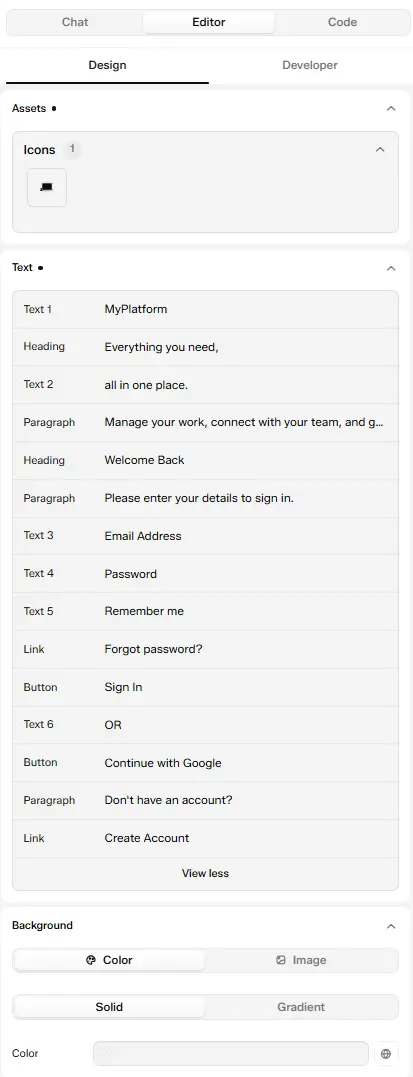
The Design tab: Assets, Text, and Background sections
Content: Insert Dynamic Values
The Content panel sits above the style panels and holds the selected element's text. Click the database icon beside it to open Insert dynamic value, a searchable list of fields you can bind instead of typing static text. Pick one, and the element displays that live value instead of fixed text.
Free ships four dynamic tags: Post Title, Post Image, Post Content, and Post URL. Every other field below, including all of Product, Current User, This Term, Site, and URL/Request, needs UiChemy Pro. A Pro field still shows in the picker on Free, it just resolves to nothing until you upgrade.
Dynamic Value Sources
What Insert dynamic value can pull from. Each is a separate data source in the picker, click through Source → Field, and for a value that points at another item (like a post's author), keep clicking to drill into that item's own fields.
Filters (Transform a Bound Value)
Once a value is bound, apply a filter to reformat it without changing the source data. Which filters are offered depends on the field's type (text, number, date, HTML, or array).
Editing Per Device (Responsive Breakpoints)
Every style you set in the Design panel is scoped to a breakpoint, not just applied everywhere at once. Switch device with your builder's own responsive-mode switcher, in Elementor, that's the Desktop/Tablet/Mobile icons in its top bar, and the Design panel follows along: it shows and edits styles for whichever breakpoint is currently active there, including any extra breakpoints your site defines (Widescreen, Laptop, Tablet Extra, Mobile Extra).
A value you don't set at a narrower breakpoint isn't blank, it inherits from the next breakpoint up (Tablet falls back to Desktop, Mobile falls back to Tablet, and so on), the same cascade Elementor's own responsive controls use. Set a property once at Desktop and it applies everywhere until you override it at a narrower breakpoint.
This follows Elementor's device switcher specifically. Responsive per-breakpoint editing inside the Composer panel has only been confirmed working in the Elementor editor.
Design Tab
The Editor tab opens on Design, a short, simple panel made for quick content and style changes. The controls you see depend on what you select: pick the whole section and you get an overview of everything in it, pick one element and you get just that element's content and a few style fields.
Selecting What to Edit
There are two ways to select something:
- On the canvas, click any element in your design.
- In the Layers panel, click the Toggle Layers button (the stacked-layers icon) in the Composer bottom toolbar at the bottom of the canvas. The Layers panel lists every element in the section, for example Section 2, login-container, MyPlatform, with its tag on the right. Use Search name, class or text to find one fast, then click it to select it.
Once something is selected, a breadcrumb at the top of the Design tab shows where it sits, for example Section > Box > Box > Text. Click any step in the breadcrumb to jump up to that parent.
Whole Section Selected
With the section itself selected, the Design tab gives you an overview of everything in it. A dot beside a group name, like Assets • or Background •, means it has values set.
Assets
Text
Background
Objects
Example: On a sign-in section, the Text list shows Heading: Welcome Back, Text 3: Email Address, Button: Sign In, and Link: Create Account. Click Button: Sign In to jump straight to that button's controls.
One Element Selected
With a single element selected, the Design tab shows two groups: Content, to change what the element says or shows, and a short style group named after the element type. The breadcrumb at the top tells you which element you're on, for example Section > Box > Box > Text.
Text
Plain text, like a label or a short line.
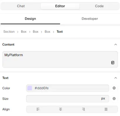
A Text element selected: Content, plus Color, Size, and Align
Heading
A heading, like a section title. It has the same fields as Text.
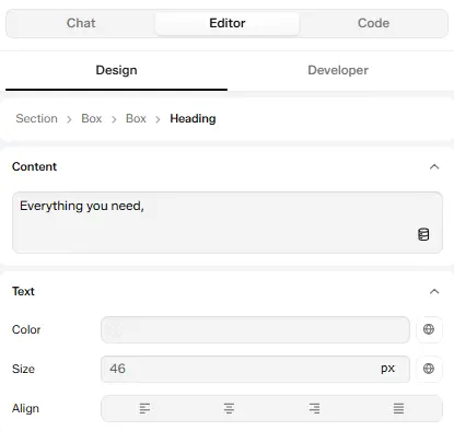
A Heading element selected: Content, plus Color, Size, and Align
Link
A text link. On top of the text fields, it has the link's own settings.
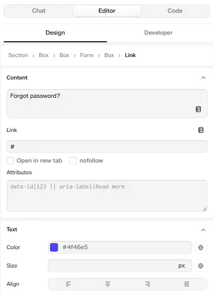
A Link element selected: Content, Link, Open in new tab, nofollow, Attributes, and Text styles
Button
A button, like Sign In.
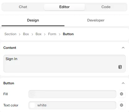
A Button element selected: Content, plus Fill and Text color
Icon
An icon, like a logo mark or a symbol.
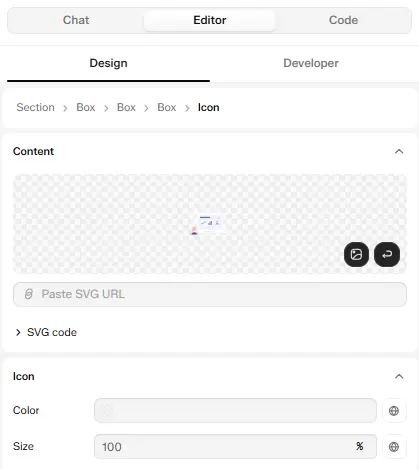
An Icon element selected: icon preview, Paste SVG URL, SVG code, plus Color and Size
Image or Video
Form Field (input, message box, dropdown)
Box, Card, or Badge
Embed
Every color and size field has a small globe icon on its right. Click it to bind the field to one of your global styles instead of a fixed value.
Example: Select the Everything you need, heading. The Design tab shows its text under Content, and Color, Size 46 px, and Align under Text. Change the size to 40 and the heading updates on the canvas right away.
For anything beyond these fields, like spacing, borders, layout, or custom CSS, switch to the Developer Tab.
Developer Tab
Developer sits next to Design in the Editor tab's sub-navigation. It has the full panel list, top to bottom: the element row, Content, Attributes, Typography, Layout, Spacing, Background, Border, Effects, Animation, Schema, and Custom CSS. Each one is explained below, in the same order. Click a property to expand it.
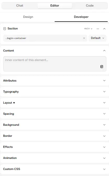
The Developer tab: the element row, then Content, Attributes, Typography, Layout, Spacing, Background, Border, Effects, Animation, and Custom CSS
Element Row
The row at the top of the Developer tab gives you deeper element-level access:
None of this row appears in Design mode, it's Developer-only. See Design vs Developer Mode for what each mode restricts.
Content
The selected element's inner content, with the database icon to bind it to a live value. See Content: Insert Dynamic Values for every source and filter.
Attributes
Add custom HTML attributes to the selected element with + Add Attribute, as free key/value pairs. Use this for things the UI doesn't have a dedicated field for, like data-* attributes for tracking scripts, aria-* attributes for accessibility, or id for a jump-link anchor.
style, class, href, and target can't be added here, they're controlled by their own dedicated fields (the style panels, Class, and Link) instead.
Each panel only shows its most common fields by default. Click + Add property at the bottom of a panel to reveal the rest, the number beside it (for example 15 available) counts how many are still hidden. Once you add one, it moves up into the panel's main list.
Typography
Layout
Flex Container group (only shows once Display is set to Flex)
Gaps group
Flex Item group (set on one child, not the whole row/column)
Grid group (only shows once Display is set to Grid)
Spacing
Two nested visual boxes, an outer Margin box and an inner Padding box, Top, Right, Bottom, and Left on each. Click a side and type a value.
Background
Border
Effects
Animation
Exposes GSAP values from the section's JavaScript as editable fields. It's a multi-step flow, so it has its own section: see Animation: Editing GSAP Values Visually.
Schema
Adds structured data (JSON-LD) to the section, the <script type="application/ld+json"> blocks search engines read. Pick a type from Select a schema type: FAQPage, HowTo, Review, Product rating, Event, VideoObject, or ItemList. Edit the JSON to add, then click Add. Existing blocks in the section are listed so you can edit them (Apply, Discard) or Remove them.
Custom CSS
The last style panel, for anything the other panels don't cover. Write raw CSS property/value pairs directly, they apply straight to the selected element, the same as if you'd typed them in a stylesheet. Use this as an escape hatch for a one-off property the visual panels don't expose yet, instead of switching to the Code tab for a single line.
Animation: Editing GSAP Values Visually
What GSAP is. GSAP (GreenSock Animation Platform) is a widely used JavaScript animation library for building smooth, high-performance motion, scroll effects, hover states, staggered reveals, and similar interactions.
Generating a GSAP animation with AI Chat. In the Composer's Chat tab, connect your CLI tool and describe the section along with the animation you want, GSAP ScrollTrigger effects, parallax, reveals, and so on.
Example prompt: "Create a clean About Us section with an image, heading, description, and statistics. Add GSAP ScrollTrigger animations with image parallax and smooth content reveals."
Once the section is generated, switch to the Editor tab's Developer mode. Its Animation panel, which sits in the style panel list right after Effects and before Custom CSS, now reflects that the section animates: "This section does animate. Extract its values to get controls," with an Extract N values from the code button, the count matches how many animation values UiChemy found.
Extracting and editing values from this panel is a Pro feature. On the free plan the animation still runs normally on the live site, but the Extract button and the value fields are locked behind an upgrade prompt, you'd need to open the Code tab and edit the JavaScript by hand instead.
This works the same way for a Hero section, a Sign-Up Form, or any other section, describe the GSAP animation you want when you generate it, then use the Animation panel afterward to extract and customize its values.
Click Extract to see the detected values
A Found in the Code checklist appears, listing every GSAP property UiChemy detected, grouped by the element or timeline step it belongs to, things like Ease, Repeat, Yoyo, Scale, and Duration, each with its current value and a checkbox.
Choose which values to extract
Every value starts checked except ones UiChemy can't safely turn into a field. Uncheck any others you don't want as a control, then click Add N options (the count updates as you check or uncheck) to confirm.
Extracting doesn't change the animation. The values stay exactly as they are, UiChemy just rewrites the code to read them from the new editable block, so nothing changes until you actually adjust a field.
See the fields appear
The Animation panel now lists the extracted properties as live fields, grouped under a heading like Whole section: a dropdown for each Ease value, and number inputs (with a unit like s where relevant) for Duration, Repeat, and Scale.
If you left some detected values unchecked, or the section has more than one animation, an Extract N values from the code button stays at the bottom of the panel so you can pull in the rest later.
Change a value
Open a field, for example Ease, and pick from the options UiChemy detected in your code (none, power1.out, power1.in, power1.inOut, power2.out, and so on). The change applies to the live preview immediately, no need to open the Code tab or edit JavaScript directly.
Scroll Timeline: Retiming Every Scroll Animation on the Page
Once a page has GSAP scroll animations on it, a Scroll Timeline (Beta) button appears in the bottom-right corner of the front end, next to the canvas toolbar. It's a different way into the same underlying values the Animation panel's Extract flow works with, instead of opening one widget's Animation panel at a time, it shows every scroll-driven animation on the whole page at once, laid out against where you actually scroll to trigger them.
Scroll Timeline puts retiming entirely in your hands. Once it's turned on, you can adjust every scroll animation's start point, end point, and easing directly from this panel, no developer or code edit needed. It's a hassle-free way to fine-tune scroll effects yourself.
The button only shows up when Scroll timeline is on for the site. It's on by default. If you don't see it, go to UiChemy → Settings → General, turn on Scroll timeline, then click Save changes. It also only appears on a page that actually has a GSAP scroll animation running, on any other page there's nothing to show.
Open the timeline
Click Scroll Timeline in the bottom-right corner. A panel docks along the bottom of the screen, with a ruler across the top marking your actual scroll position in pixels, for example 0160 / 13189px means you're 160px into a page that scrolls 13,189px total.
Find an animation
Animations are grouped by the section they belong to, group headers like Hero Narrative or Testimonials, with one row per animated element underneath. Each row's bar shows exactly where along the page's scroll range that animation plays.
Scrub the page
Drag the playhead along the ruler to scroll the live page to that exact position, so you can see precisely what's on screen when an animation starts or ends.
Retime an animation
Drag a bar's left or right edge to change where that animation starts or ends as the visitor scrolls, without touching a single line of code.
Edit its values
Click a bar to open its property popup. The fields shown depend on that specific animation, for example a text reveal might show Ease, Starts at, Letter stagger, and Word hold, while an image effect might show Rise, Duration, Stagger, and Image drift. Adjust what you need, then Save.
This reads live GSAP ScrollTrigger data directly off the page, so it reflects animations generated by AI Chat or written by hand in the Code tab, whether or not you've ever opened that widget's own Animation panel to extract values.
WebGL Animation: Built in the Code Tab
What it is. WebGL uses your computer's GPU to render graphics directly in the browser. It's what powers 3D objects that rotate and move, particle effects, and fluid visuals well beyond what plain CSS can do.
How it's built. There's no dedicated visual panel for WebGL yet, it's written as code, the same as any other custom section:
Write the code
Whether it comes from an AI connected over MCP, the Composer's AI Chat, or you write it by hand, it lands in the Code tab's Standard scope: markup in the HTML panel, styling in the CSS panel, and the WebGL setup in the JS panel.
Add a 3D library
Open the Code tab's Assets panel, the Catalog tab has a dedicated 3D category, ready to add without hand-typing a CDN URL. See Loading a Third-Party Library.
Editable controls for tuning a WebGL animation's own values aren't documented yet. This section will be extended once that's available.
How to Make a Change
- Select an element. Use the layer panel to pick any container, heading, button, link, image, or other element in the section.
- Style it. Shape the selected element through the seven style controls.
- Reuse your brand styles. Apply a synced Figma global class, or create a new one.
- Check the live preview. Every change updates instantly, so you always see the real result.