

How to Export Figma Design in Responsive Layout Using Responsive Manager in UiChemy?
Customize font size, line height, padding, and flex gap per device using UiChemy's Responsive Manager.
When you choose Smart Auto Responsive during conversion, your design comes out about 95% responsive by default. If you want to manually customize the responsive values, choose Manual Responsive Setup instead.
The values set in your Figma design are treated as the desktop value in Responsive Manager, which is then used to calculate the responsive values for other devices.
Why Use Manual Responsive Setup
- Full control per device, set exact font size, line height, padding, and flex gap for tablet and mobile instead of relying on Smart Auto's estimated 95%.
- Add breakpoints beyond the defaults, go past Elementor's standard tablet and mobile sizes if your design needs it.
- No code or theme editing, every value is set inside the plugin at export time, nothing to touch in Elementor or your theme afterward.
When to Use It
Use Manual Responsive Setup when Smart Auto's ~95% result doesn't match your design closely enough, for a pixel-perfect client handoff, or when your design system specifies exact per-breakpoint values. Stick with Smart Auto Responsive for most standard websites, where an approximation is close enough and you'd rather not configure every value by hand.
Export as Regular Responsive Layout
- Open the UiChemy plugin in Figma and make sure you're logged in.
- Select your frame, choose Classic Mode → Step by Step Method, and continue through to Step 6: Responsive.
- By default, Smart Auto Responsive is selected, giving about 95% responsiveness. To set custom values, select Manual Responsive Setup.
- From here, you can adjust font size, line height, padding, and flex gap for different screen sizes.
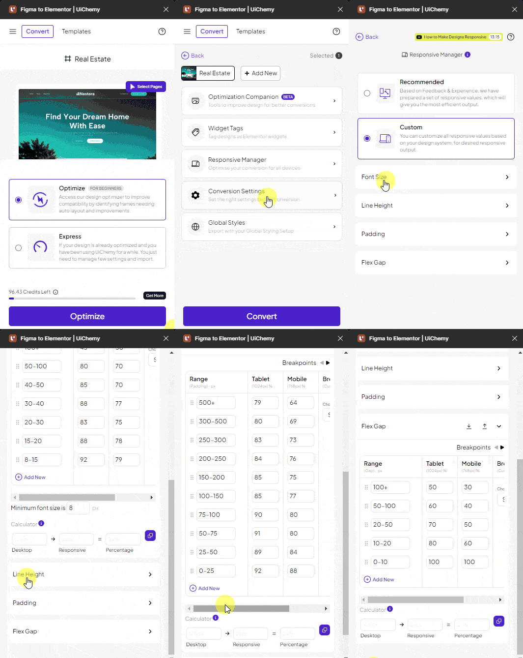
Font Size
From the Font Size tab, adjust font size per screen size in two ways:
-
Normal, uses a fixed pixel value for different screen sizes
-
Clamp, uses a CSS Clamp value for fluid font size across screen sizes
-
Desktop, a list of pixel thresholds (
10+ px,20+ px,30+ px, and so on), each row applies once your Figma font size reaches that value. -
Tablet, a percentage of the Desktop value for that row, with an AutoFill option to fill in the percentages automatically instead of entering each one by hand.
-
The Mobile column works the same way as Tablet.
For example: the 20+ px row is set to Tablet 96%. A heading with a 20px font size in Figma matches that row, so its exported tablet font size is 19px (96% of 20px).
Click + Add New to add more rows beyond the defaults (requires UiChemy Pro).
Rows are evaluated in order, so keep them sorted by threshold to get the result you expect.
You can delete a row with the cross button beside it, and drag-and-drop to reorder rows. Below the table, the Minimum font size is field sets a floor so the font size never goes below that value (8px by default), regardless of the responsive table. The Viewport min and max fields only appear in Clamp mode (see Fluid Layout). You can also use the Calculator to work out responsive values.
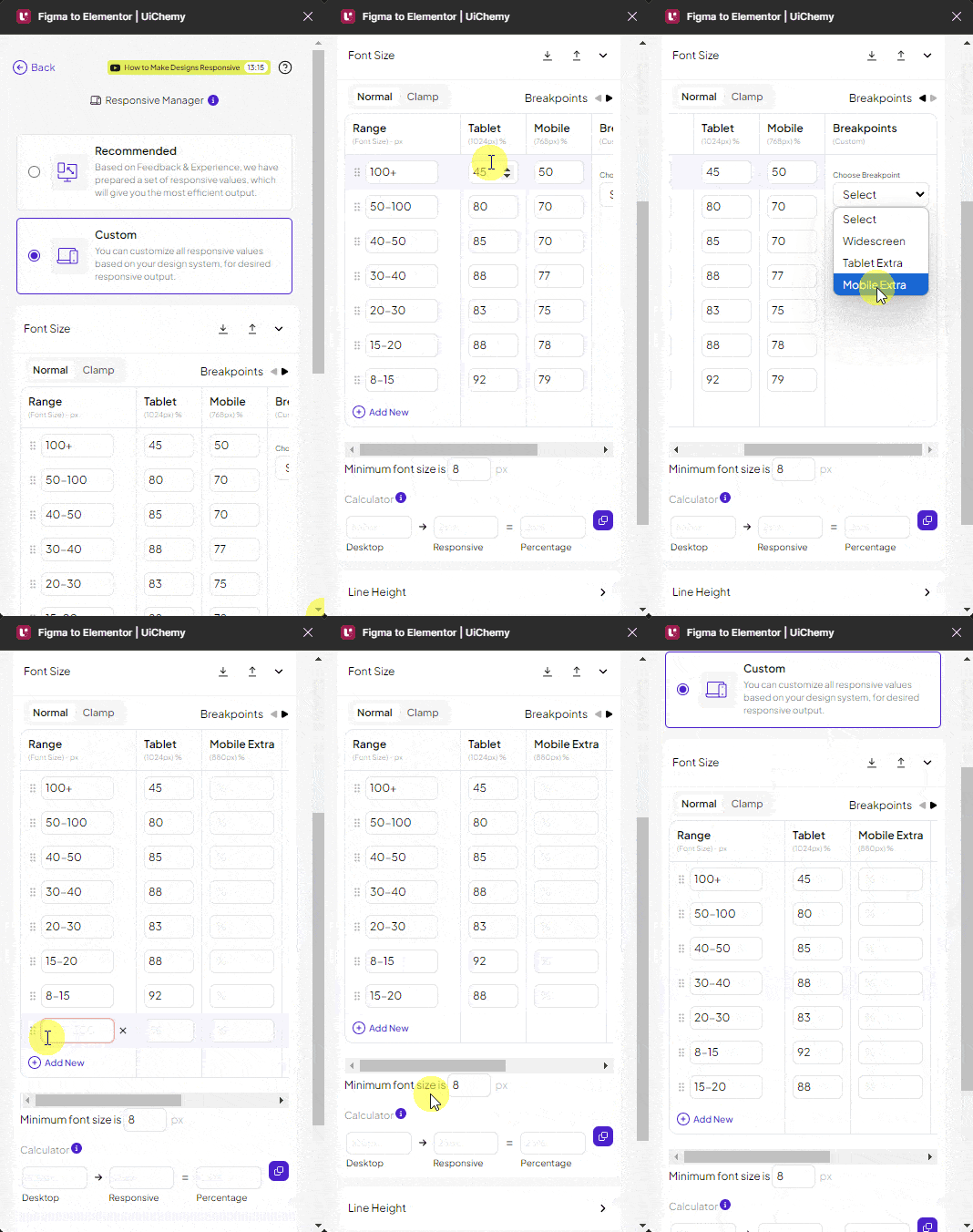
Line Height
From the Line Height tab, adjust line height per screen size.
- Unit switch, pick % (the default) or px for the line height table, so you can work in the unit your design system uses.
- Desktop, a list of line height thresholds (
80+,100+, and150+by default), calculated against the line height set in Figma. In % mode, a Figma line height set in pixels is converted to a percentage first. - Tablet / Mobile, set responsive values as percentages, same as Font Size, with the same AutoFill option.
For example: the 150+ row is set to Tablet 90%. A paragraph with a 150% line height in Figma matches that row, so its exported tablet line height is 135% (90% of 150%).
In the exported file, line height values are in em. The responsive feature won't work if a mixed font size or line height is applied within a single text/paragraph in Figma.
Add or delete rows the same way as Font Size. Set the Minimum line height is value so line height never drops below it (80% by default), regardless of the responsive table. This field follows the unit you picked, and UiChemy converts its value for you when you switch between % and px.
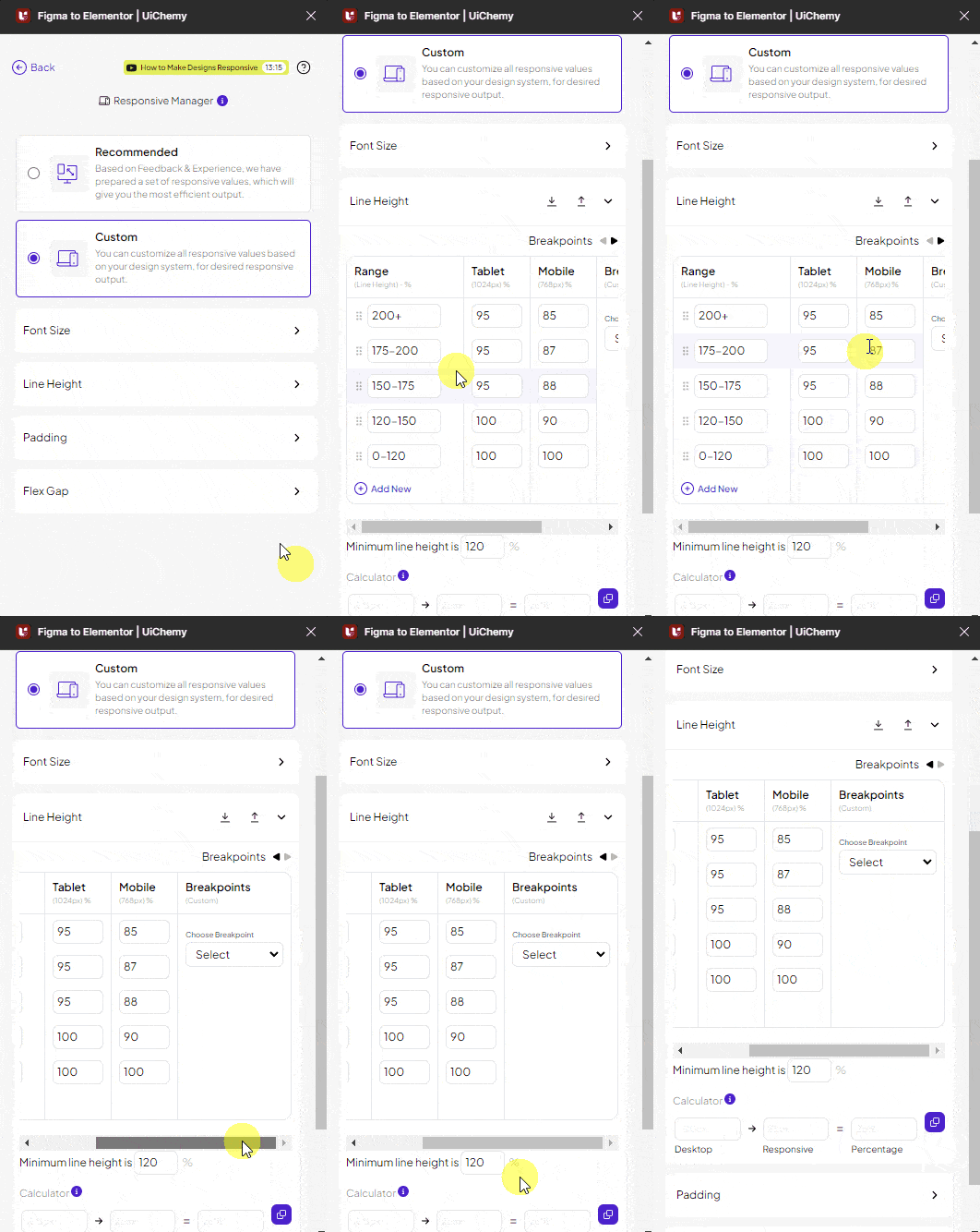
Padding
From the Padding tab, adjust padding per screen size.
- Desktop, a list of padding thresholds in pixels (e.g.
10+ px), calculated against the padding set in Figma. - Tablet / Mobile, set responsive values as percentages, with the same AutoFill option.
For example: if you set the 10+ px row to Tablet 60%, a section with 20px padding in Figma matches that row, so its exported tablet padding is 12px (60% of 20px).
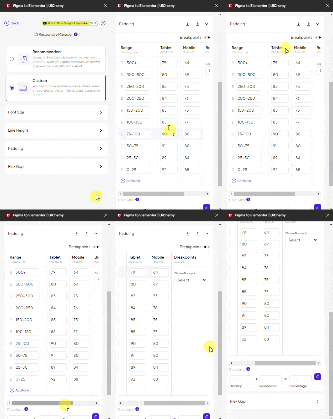
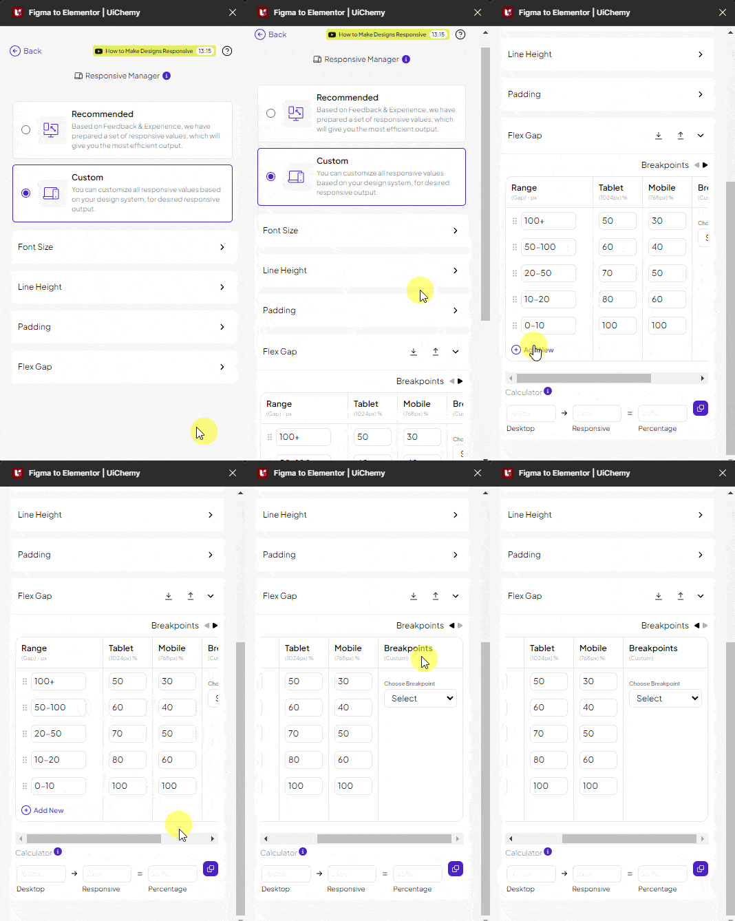
Flex Gap
From the Flex Gap tab, set the flex gap per device.
- Desktop, a list of flex gap thresholds in pixels (e.g.
10+ px), calculated against the gap set in Figma. - Tablet / Mobile, set responsive values as percentages, with the same AutoFill option.
For example: if you set the 10+ px row to Tablet 60%, a section with a 20px gap in Figma matches that row, so its exported tablet gap is 12px (60% of 20px).
Once your settings are done, go back with the Back button at the bottom, then click Next. When you export the design, the exported template uses your custom values as the responsive values.