

How to Use Calculator in Responsive Manager?
Use the Calculator in UiChemy's Responsive Manager to quickly work out responsive percentage and pixel values.
When you choose Smart Auto Responsive during conversion, your design comes out about 95% responsive on most devices by default. You can customize the responsive values further using Manual Responsive Setup.
While exporting as a regular responsive layout, you have to enter responsive values for different devices individually as a percentage of the desktop value. To simplify this, use the Calculator feature of the Responsive Manager.
Why Use the Calculator
- No manual percentage math, work out a device's percentage or pixel value directly instead of calculating it yourself and risking a typo.
- Works both directions, get a percentage from two pixel values, or a pixel value from a percentage, whichever direction you're working in.
- Consistent results, since every value is calculated the same way, your responsive sizing stays consistent across Font Size, Line Height, Padding, and Flex Gap.
When to Use It
Use the Calculator whenever you're in Manual Responsive Setup and know the pixel result you want on tablet or mobile, but need the percentage to enter into the field, or want to double-check one before typing it in. Skip it entirely if you're using Smart Auto Responsive, there are no percentage fields to fill in there.
Calculate the Percentage
Once you're on the Responsive step, select Manual Responsive Setup, you'll find the Calculator at the bottom of the popup for Font Size, Line Height, Padding, and Flex Gap. There are three fields: Desktop, Responsive, and Percentage.
Enter the desktop value in the Desktop field, and the value you want on the responsive screen in the Responsive field. The Percentage field auto-calculates the percentage you need to enter in the respective device field.
For example, if you've set a 100px font size for desktop and want 45px on tablet, enter 100 in Desktop and 45 in Responsive, the Percentage field shows the result. Copy it and paste it into the Tablet field.

Calculate the Pixel Value
You can also work the calculation in reverse, find the responsive pixel value by entering the Desktop value and a Percentage, and the Responsive field shows the resulting pixel value.
For example, if you've set 80px font size on desktop and want 35% for mobile, enter 80 in Desktop and 35 in Percentage, the Responsive field shows the resulting pixel value.
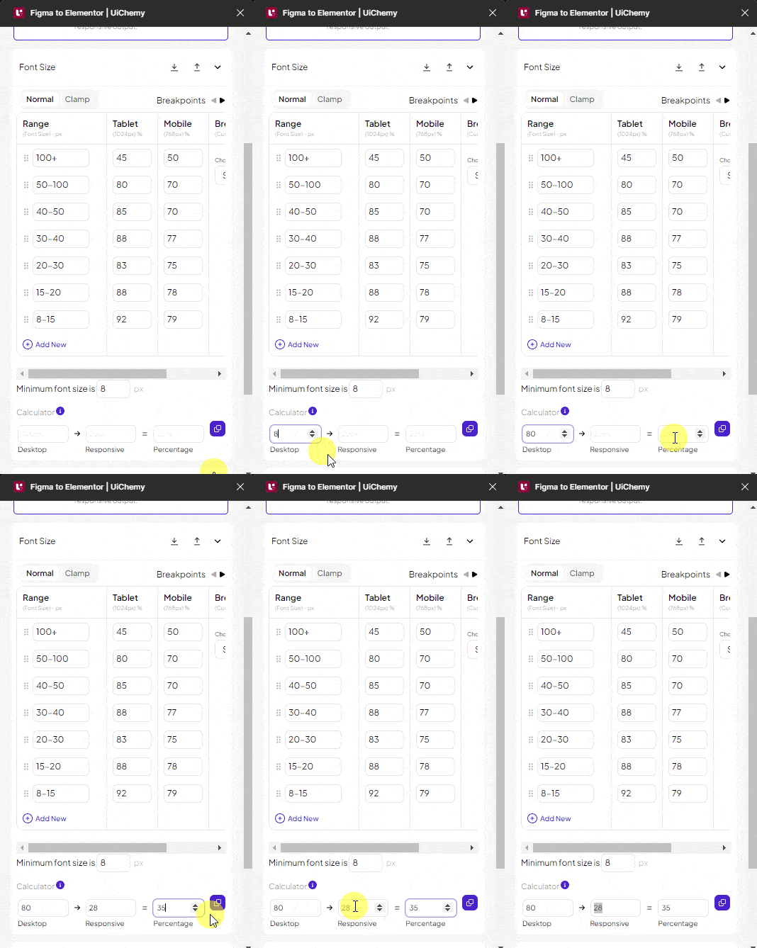
Using the Calculator feature, you can set more accurate values across responsive devices.